ui_illustration_short

Customize & Configure Hundreds Of Design Elements

1-Nov-04-2021-10-33-46-10-PM

Text Attributes

Font, color, size, spacing, number of text fields, line height, alignment, and background color.

2-Nov-04-2021-10-34-10-96-PM

Cell Styles

Cell size, background color, corner radius, runtime, badges, and icons.

3-Nov-04-2021-10-34-31-54-PM

Image Style

Image aspect ratio, placeholder color, image overlay, and corner radius

4-3

And More

Background and focus state color, scenarios to use different icons, scaling parameters... and more.

Ultimate UX Guide For Streaming Apps

download_UI

See the key screens video-first brands should include, learn the sticky design theory behind the decisions, and see how to create wonderful UI using Zapp.

How We Build UI For You To Use

build UI


We build a level of abstraction into UI and UX so it can be productized and configurable. Apps are comprised of screens which are connected together via navigation elements. Screens contain components (heroes, carousels, rails, lists, grids, etc.), components contain cells, cells are populated by CMS/OVP feeds, which present the metadata and content to your users.
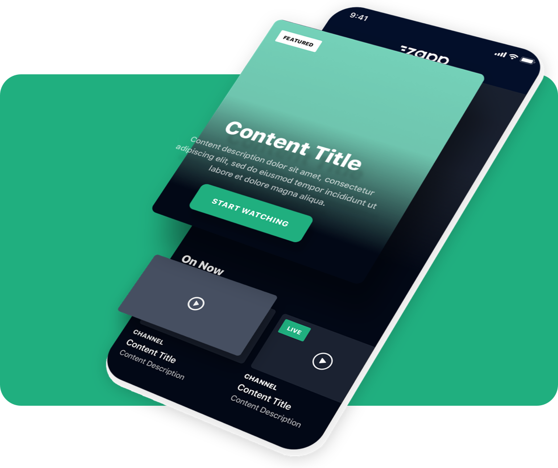
 

Mix And Match UI Components To Create Infinite Design Possibilities

See what Applicaster can do for you.

We’re excited to discuss how Applicaster can help you meet your business goals. 

Please provide us with some basic information and one of our team members will be in touch shortly to schedule a demo.