


Text Attributes
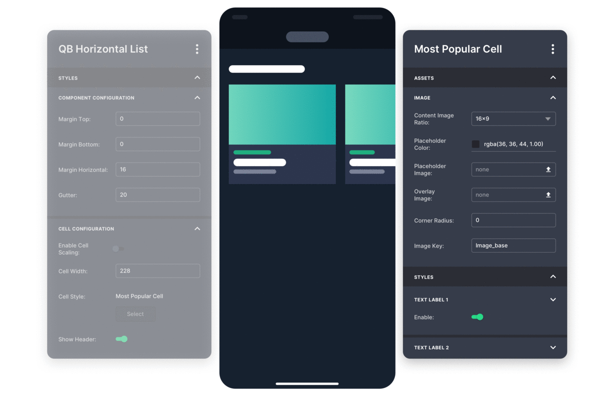
Font, color, size, spacing, number of text fields, line height, alignment, and background color.


Font, color, size, spacing, number of text fields, line height, alignment, and background color.

Cell size, background color, corner radius, runtime, badges, and icons.

Image aspect ratio, placeholder color, image overlay, and corner radius.

Background and focus state color, scenarios to use different icons, scaling parameters... and more.

We build a level of abstraction into UI and UX so it can be productized and configurable. Apps are comprised of screens which are connected together via navigation elements. Screens contain components (heroes, carousels, rails, lists, grids, etc.), components contain cells, cells are populated by CMS/OVP feeds, which distribute metadata and content into the cells.

Read the Ultimate UX Guide for Video Apps
We’ve researched the best video apps UX, learn the sticky design theory behind their decisions.


